
Redesigning Exam Scheduling
Case study from 2017: The client is a preventive healthcare company that provides comprehensive health exams and guides patients to live healthier. The goal of this project was to quickly improve the appointment scheduling experience without drastically changing the existing workflow.

Due to confidentiality agreement, I generalized the content.
Problem: Number of bookings declined by 30% compared to the previous year.
Solution: Improve appointment scheduling experience, emphasize rescheduling, in addition to other occurrent improvements.
My Role:
Analyze user journey to identify points of friction
Create proposals, prototypes, and get stakeholders' buy-in
Work with project manager to document all requirements as Agile stories
Develop HTML prototype and production-ready CSS
(Later) Collaborate with another designer on visual and user interface design
High Level Objectives:
Quick turnaround (less than 4 weeks) in an effort to improve booking process immediately
Minimal change in functionality and workflow
Work with existing brand colors and blend new design into existing site
Six months later, we redesigned the page after rebranding
Target Audiences: We have two existing personas. Both of them are infrequent users of the scheduling feature, and both of them are looking to book appointments for relevant procedures at a convenient locations and times.
Research Current System:
I evaluated current scenarios, created workflow diagram
Gathered user feedback from support teams
Reviewed Google Analytics to identify time spent on page and drop off points
Conducted usability study as well as competitive analysis
Pain Points:
The booking process was broken into many steps.
Irrelevant information pushed call-to-action to the bottom of the page (below the fold).
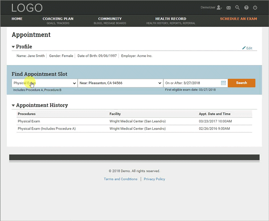
The appointment time slots covered multiple facilities, color-coded based on location. This system slowed users down.

Constraints: Based on time limitation and discussions with development team, we could not
display physical exam appointment availability on load (performance issue)
display interactive maps
allow patients to request specific physicians
list physician information
Competitive Analyses: I studied other medical appointment scheduling applications, such as Zocdoc, Kaiser; as well as sites with reservation functionalities in other industries, such as OpenTable, Expedia, momondo, and Southwest.
Wireframe: Through paper sketches, reviewing Figma wireframes, and team discussions, we explored the idea of giving users more control upfront.

Question and Data: Google Analytics data and my usability study showed the color-coded facility selection page slowed users down. Team members explained it was designed to show the earliest appointments. However, I wondered if our patients cared more about time or location. To answer that, I collaborated with an engineer to examine data from the past three years, to see what percentage of patients returned to the same facility. The results indicated our users cared more about location than the earliest availability. It convinced concerned team members to explore a new design.
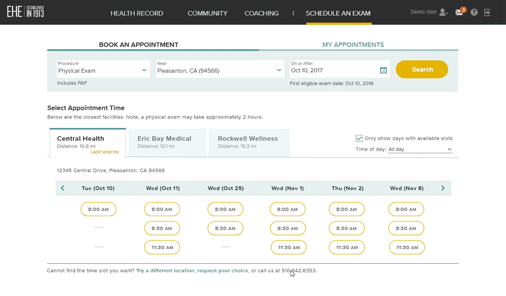
HTML Prototype and Launch: I created and presented the following prototype to the business and clinical teams which removes extraneous information, combines the first two pages of booking into one, and streamlines facility selection. It was approved.
In less than four weeks, we went from brainstorming the solution to launching the changes. Follow up analyses showed the drop off rates decreased and appointment bookings increased by 30%.
Six months later, we rebranded. I redesigned the look-and-feel of the entire website to match our new brand. We adjusted the layout and improved the visual design.
Reflections
Through this project, the team and I learned the value of taking risks informed by data.
Proactively conduct research prioritize usability improvements outside of “project boundaries”—Depending on the organization, if we wait until a project is in motion, there may not be time to add delighters such as interactive map.